Call us USA (+1)312-698-3083
| Email : sales@wappnet.com
The user interface (UI) design is crucial as it forms the first impression of your app, and it should be nothing short of exceptional. UI and user experience (UX) design are integral to the app development process. Clear visual hierarchy plays a significant role in guiding users’ attention to important elements by strategically using size, color, and placement. In mobile and web application development, the user interface is a critical element that requires careful implementation of specific UI components for optimal success. When designing a mobile app, consider the following key elements:

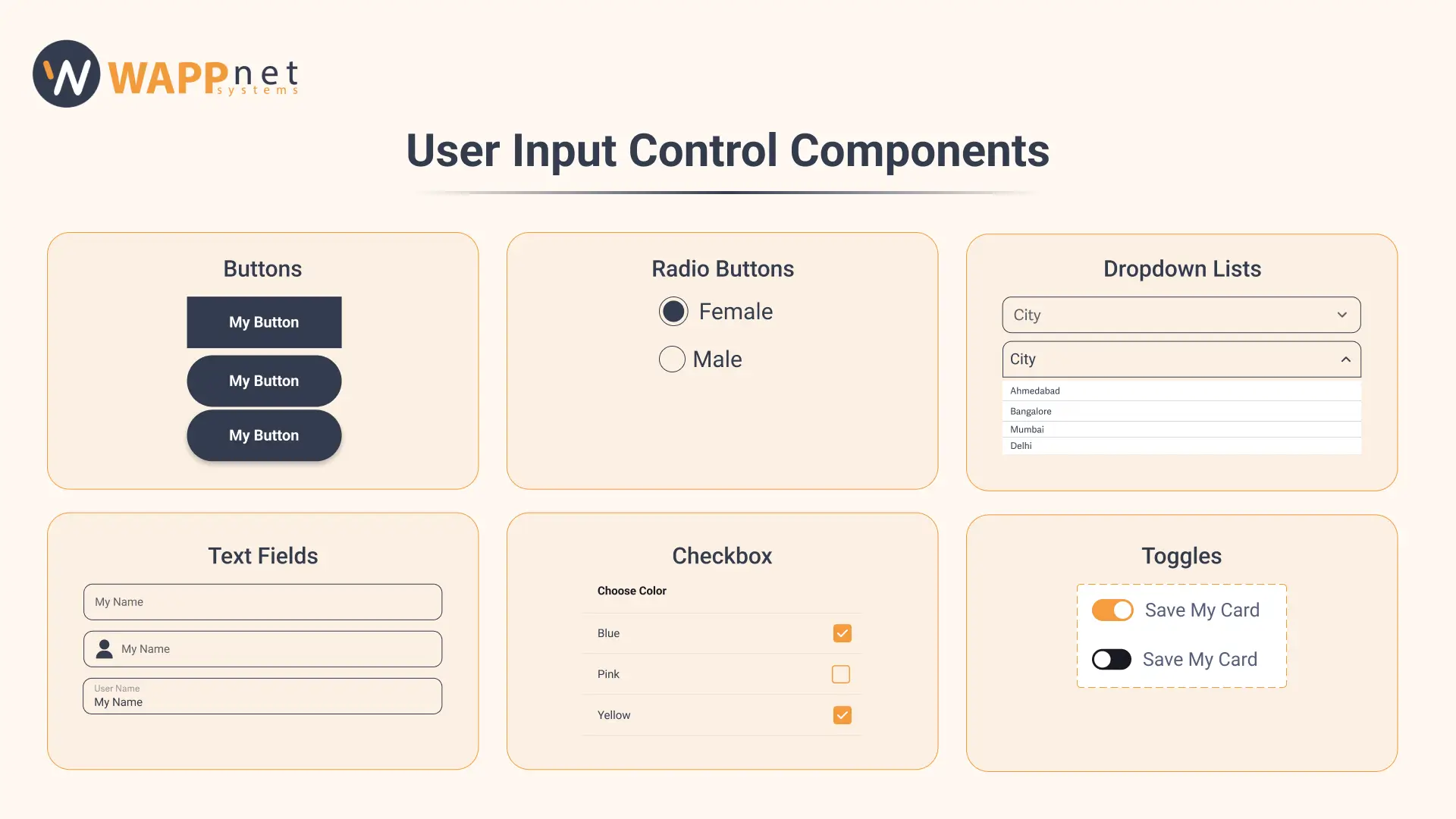
Buttons:
Buttons are guiding users and encouraging interaction. Buttons are key to mobile app design, guiding users with clear calls to action and easy interaction. Buttons should be visible, tap-friendly, and consistent in style. Strong contrast and clear text ensure accessibility, while visual cues like shadows enhance clickability.
Text fields:
Text fields are essential in mobile app design, facilitating user input and data collection. Password fields need security options like masking and visibility toggles. Ensure accessibility with good color contrast and screen reader compatibility. Tools like character counters and progress bars improve task completion, and consistent design maintains a polished look.
Dropdown lists:
A dropdown is a user interface (UI) component that enables users to choose one option from a set of available selections. Frequently utilized in various interfaces, dropdowns offer a compact and efficient way to manage selection controls. They can be activated by clicking or tapping on a toggle button, which opens or closes the dropdown menu.
Radio buttons:
Radio buttons are key elements of forms that facilitate selection when users need to choose one option from a mutually exclusive list of two or more choices. Clicking a radio button will deselect any other button that was previously selected in that group. Radio buttons are essential for simplifying user choices and ensuring effective interaction in mobile app development.
Checkboxe:
A checkbox serves as a UI component that permits users to indicate a binary choice, typically represented by a small box that can be toggled on or off. They play a significant role in gathering user input and facilitating option selection in forms and other interfaces.
Toggles:
A toggle serves as a user interface component that allows users to alternate between different states or options. A well-known example of a toggle is a switch that can be turned on or off. Additional examples include radio buttons, checkboxes, and dropdowns. Toggles offer a convenient and efficient way for users to make selections without the need to navigate through multiple screens or menus.
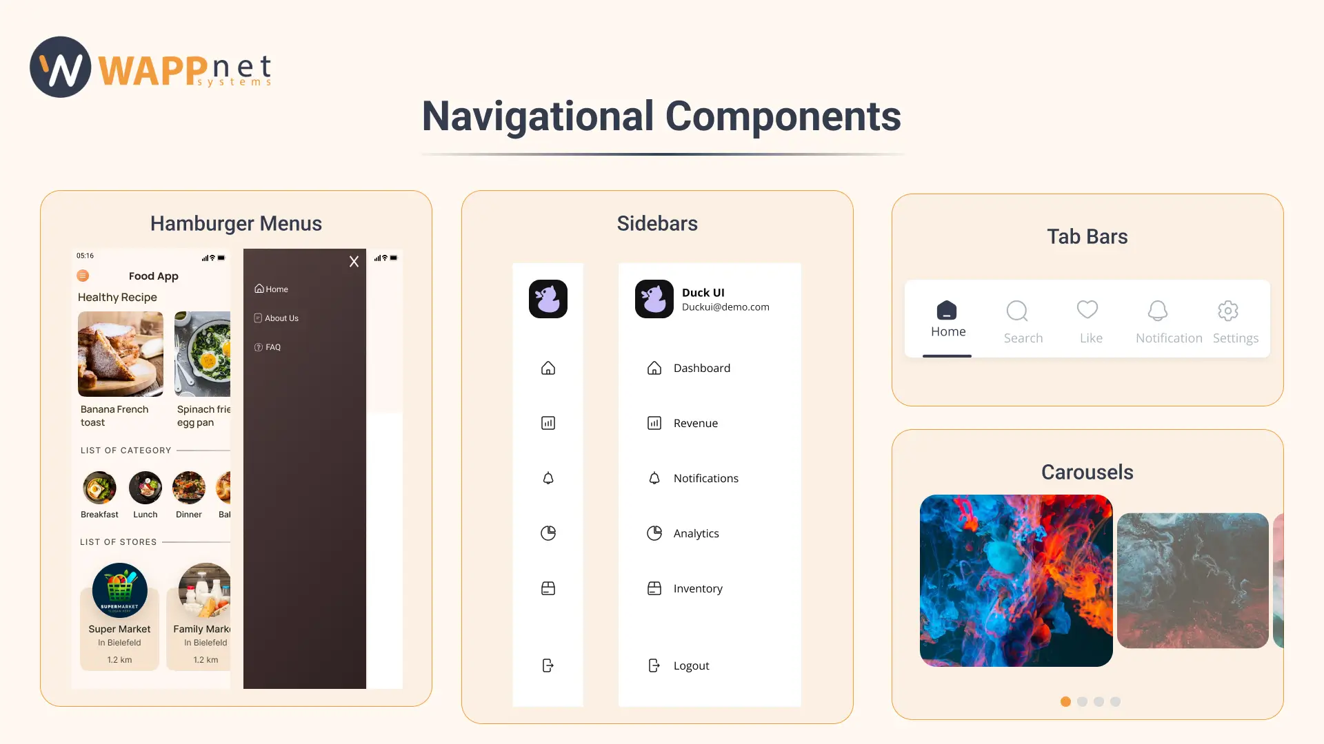
Hamburger menus:
A hamburger menu is a navigation tool symbolized by three horizontal lines, often seen in mobile apps and websites. Typically placed in a corner of the interface, this compact button expands to show a list of navigation options when tapped. Hamburger menus help declutter screens by hiding less critical navigation items, thus maximizing the space for main content, especially on mobile devices. While they are widely used, it’s important to consider user experience; some users may find them less intuitive, so clear labeling and consistent placement can enhance usability.
Sidebars:
Sidebar navigations assist users in navigating through an application, offering vertically stacked navigation items that are ideal for organizing large menus. They should provide clear, accessible links to all necessary areas of the application without becoming cluttered or overwhelming for the user.
Tab bars:
A tab bar is a graphical control element in user interfaces that helps organize and present multiple tabs or content pages. It is frequently used in web browsers, mobile applications, and other software to simplify navigation across different areas.
Carousels:
Carousels are particularly useful for highlighting featured content, promoting various offerings, or displaying data sequentially. Consistent layout and design across carousel items help prevent user disorientation. While carousels can improve user engagement, overuse can lead to confusion and reduced usability.
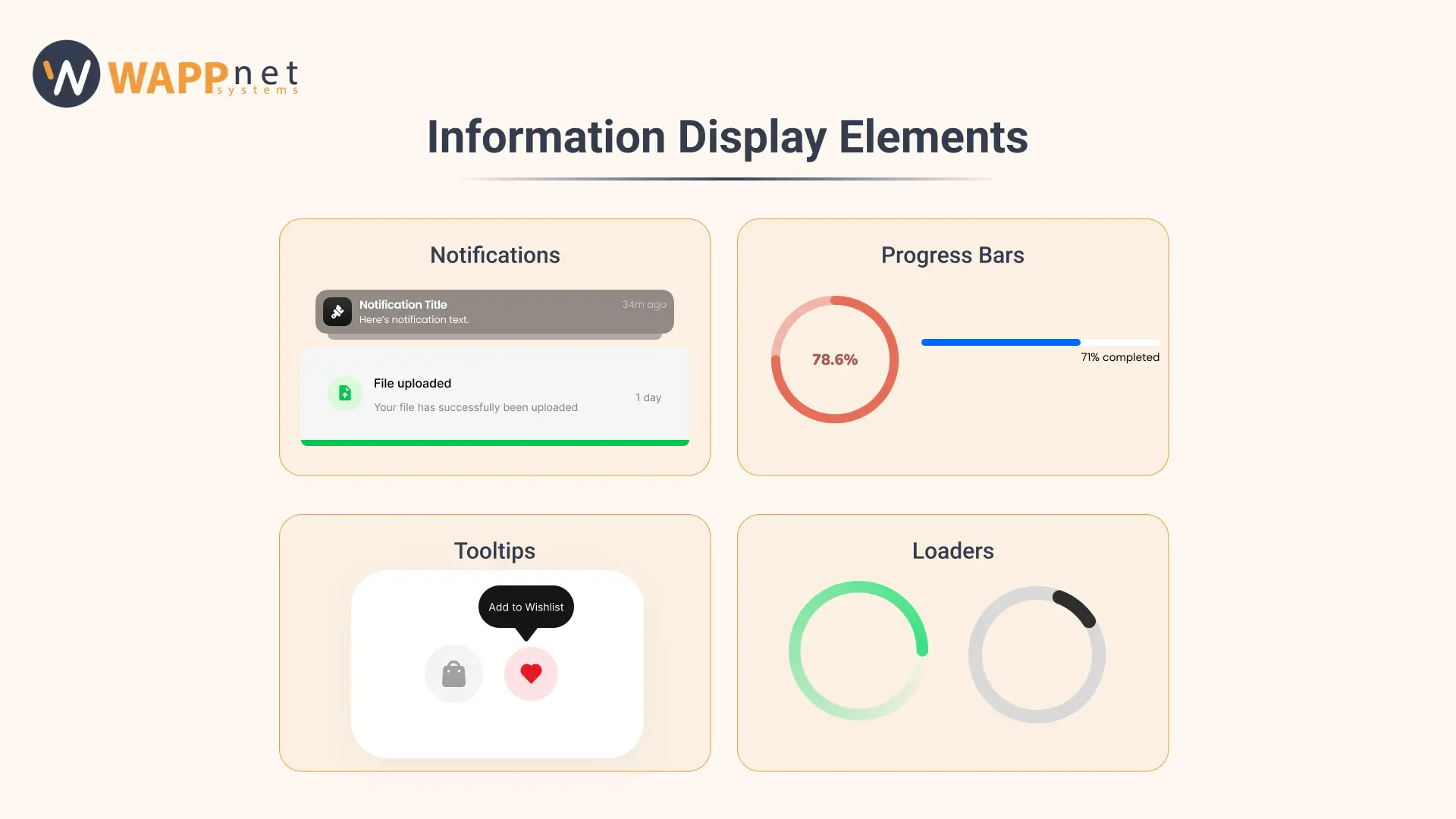
Notifications:
Notifications are important components of apps that communicate essential updates or events to users. They deliver concise and timely information, helping maintain user engagement even when the app isn’t actively in use. They are an effective way to improve user retention by encouraging return visits, especially for users who haven’t opened the app recently. To be effective, notifications should be meaningful, personalized, and useful, and it’s important to ask for permissions properly to boost engagement.
Progress bars:
Progress bars show users how much of a task they’ve completed, often displayed as a bar with a percentage marker. By segmenting larger tasks into smaller, manageable parts, progress bars set user expectations about the time needed to finish. From a psychological angle, completing a progress bar creates a sense of fulfillment, which positively impacts the app’s overall user experience.
Tooltips:
Tooltips in mobile app design are small pop-up messages tied to a particular UI element or screen location. They are generally text-based and serve to offer contextual guidance, introduce key features, or notify users of new updates while using the app.
Loaders:
Loaders indicate background activity within an app, subtly informing users to wait. The spinner, one of the most common loaders, begins in gray and gains color as the task progresses. This compact element is key for user experience, assuring users that the app hasn’t frozen. Loaders can also disguise performance issues like latency, particularly when combined with interactive or visually appealing loading screens.
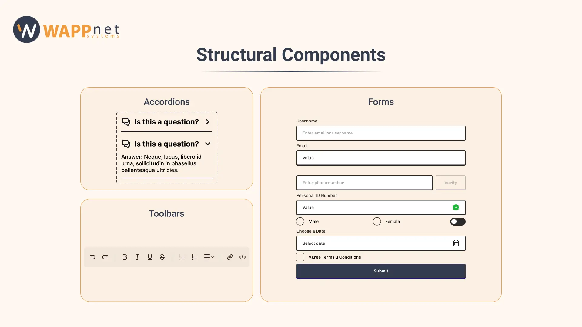
Accordions:
An accordion is a design element that reveals hidden information by expanding in place, pushing the surrounding content down rather than overlaying it. This functionality makes accordions particularly valuable in mobile designs, where they help consolidate information into a compact format, enabling users to see the overall structure while concentrating on essential details.
Toolbars:
Toolbars are graphical user interface components that offer quick access to essential tools, functions, or commands in software applications. They usually consist of icons or buttons and are arranged either horizontally or vertically for easy use.
Forms:
Forms are vital components in creating mobile app design to collect and process data, such as user contact details or order information. A form is made up of individual input fields and a submit button that, when clicked, processes or sends the data to a server. To minimize clutter, consider breaking the form into multiple screens, each containing about three to four input fields.
In conclusion, creating a successful mobile app design involves a careful balance of various UX elements that cater to user needs and preferences. A user-centered approach is essential for keeping the app relevant and easy to use. Each aspect significantly impacts the overall user experience. By focusing on these critical design elements, designers can boost user satisfaction and contribute to the application’s long-term success. If you are in search of a creative UX design company or planning to design unique applications, you must contact us!

